AEM Clientlibs Use Case Carousel Dialog Validation
A practical AEM Clientlibs guide showing how to extend the Core Carousel component, add custom dialog validation, and enforce 3–5 carousel items.
Content Objective
- Build an enhanced AEM carousel component using Clientlibs
- Extend the Core Carousel Component safely
- Add dialog-level validation for item counts
- Keep core clientlibs while adding custom JavaScript
- Test the component in real-time authoring
AEM Clientlibs are ideal for extending core components without breaking the foundation. This use case shows how to add custom validation to a carousel dialog while preserving Core Component behavior.
Requirement
We need an enhanced carousel component that:
- extends the Core Carousel Component
- supports a minimum of 3 items
- supports a maximum of 5 items
- validates the item count inside the dialog
- keeps the Core Carousel clientlibs working correctly
Solution Overview
To implement this, follow these steps:
- Extend the Core Carousel Component.
- Copy the dialog from the core component and preserve extraClientlibs.
- Create a
clientlibsfolder for custom JavaScript and CSS. - Add custom validation code to the dialog.
- Include core component clientlibs using
extraClientlibs.
Step 1: Extend the Core Carousel Component
Create a new component under:
/apps/yourproject/components/imagegallery
Use a component definition like this:
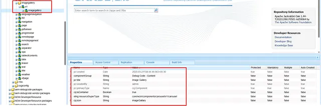
<jcr:root
    xmlns:jcr="http://www.jcp.org/jcr/1.0"
    xmlns:cq="http://www.day.com/jcr/cq/1.0"
    xmlns:sling="http://sling.apache.org/jcr/sling/1.0"
    cq:icon="imageGallery"
    cq:isContainer="{Boolean}true"
    jcr:primaryType="cq:Component"
    jcr:title="Image Gallery"
    sling:resourceSuperType="core/wcm/components/carousel/v1/carousel"
    componentGroup="Custom - Content"/>
This preserves the carousel rendering and behavior from the Core Component while allowing custom authoring logic.
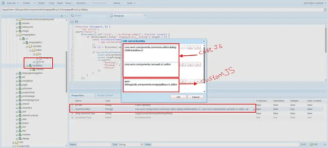
Step 2: Copy the Core Component Dialog
Copy the dialog from the core carousel component so you can customize validation. Use the same extraClientlibs values from the core dialog and add your custom category.
Example cq:dialog structure:
<jcr:root
    xmlns:jcr="http://www.jcp.org/jcr/jcr/1.0"
    xmlns:granite="http://www.adobe.com/jcr/granite/1.0"
    jcr:primaryType="nt:unstructured"
    jcr:title="Enhanced Carousel"
    sling:resourceType="cq/gui/components/authoring/dialog"
    extraClientlibs="[core.wcm.components.commons.editor.dialog.childreneditor.v1,core.wcm.components.carousel.v1.editor,yourproject.components.carousel]">

    <content
        granite:class="cmp-carousel__editor imagegallery__dialog"
        jcr:primaryType="nt:unstructured"
        sling:resourceType="granite/ui/components/coral/foundation/container">
        <!-- dialog items copied from core component -->
    </content>
</jcr:root>
Why copy the Core dialog?
- The core dialog includes the correct clientlibs for the carousel editor.
- A copied dialog lets you add custom behavior without removing core features.
extraClientlibsmust include core values to avoid breaking the editor.
Step 3: Add a Clientlibs Folder
Inside your component, create a clientlibs folder with a cq:ClientLibraryFolder node. Add a category for your custom code.
Example .content.xml for the clientlibs folder:
<jcr:root
    xmlns:jcr="http://www.jcp.org/jcr/1.0"
    jcr:primaryType="cq:ClientLibraryFolder"
    categories="[yourproject.components.carousel]"
    allowProxy="true"/>
Then add your JavaScript file under js/validation.js and your CSS under css/ if needed.
Step 4: Add Custom JavaScript Validation
Add a clientlib JS file that validates the dialog before submit and enforces maximum item count.
Example validation.js:
(function (document, $) {
  "use strict";

  $(document).on("click", ".cq-dialog-submit", function (event) {
    const dialog = $(".imagegallery__dialog");
    if (dialog.length > 0) {
      const accordionElements = dialog.find(".cmp-childreneditor coral-multifield-item");
      const ui = $(window).adaptTo("foundation-ui");

      if (accordionElements.length < 3) {
        event.preventDefault();
        event.stopPropagation();
        ui.alert(
          "Warning",
          "Minimum 3 carousel items are required!",
          "notice"
        );
      }
    }
  });

  $(window).adaptTo("foundation.registry").register("foundation.validation.validator", {
    selector: ".cmp-childreneditor",
    validate: function (element) {
      if ($(element).closest(".imagegallery__dialog").length > 0) {
        const multifield = $(element);
        const items = multifield.find("coral-multifield-item");
        const max = 5;
        const ui = $(window).adaptTo("foundation-ui");

        if (items.length > max) {
          items.last().remove();
          ui.alert(
            "Warning",
            "Maximum 5 carousel items are allowed!",
            "notice"
          );
        }
      }
    }
  });
})(document, Granite.$);
Key implementation details
- Use a unique dialog class like
imagegallery__dialog. - Keep the Core Component selector
.cmp-childreneditorso the validator runs on the correct multifield. - Use
foundation-uialerts to provide immediate author feedback.
Step 5: Preserve Core Clientlibs with extraClientlibs
The core carousel editor depends on its own clientlibs. Add them alongside your custom category in the dialog:
core.wcm.components.commons.editor.dialog.childreneditor.v1core.wcm.components.carousel.v1.editoryourproject.components.carousel
If you omit the core values, the dialog may fail to load or the carousel editor may behave incorrectly.
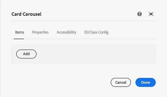
Testing the Component
Test two authoring scenarios:
Scenario 1: Less than 3 items
- Open the enhanced carousel dialog.
- Add only 2 items.
- Click Save.
- Verify the warning appears:
Minimum 3 carousel items are required!
Scenario 2: More than 5 items
- Open the enhanced carousel dialog.
- Add 6 items.
- Verify the validator removes the extra item and shows:
Maximum 5 carousel items are allowed!
Best Practices
- Always reuse core component clientlibs in
extraClientlibswhen extending AEM Core Components. - Give your custom dialog a unique class so your validation targets only the intended component.
- Keep validation in the dialog to enforce rules before content is saved.
- Avoid hard-coding selectors for unrelated components.
Summary
This real-time use case shows how to extend AEM Core Components safely and add custom dialog validation using Clientlibs. By copying the Core Carousel dialog, preserving extraClientlibs, and adding a custom validation script, you can enforce authoring rules without sacrificing core functionality.