Editable Template Architecture Deep Dive
Deep dive into AEM template policies, governance, and advanced architecture patterns. Understand page policies, component policies, policy storage, multi-site management, and how architects design scalable template systems.
Content Objective
- What are Policies in AEM?
- Page Policies vs Component Policies
- Understanding Content Policies
- Policy storage and structure
- Advanced policy configurations
- Multi-site policy management
- Why architects need deep policy knowledge
The Journey So Far
In the previous chapters, you've learned:
- Chapter 8: Templates define page blueprints
- Chapter 9: Layout Containers enable responsive layouts
- Chapter 10: Style System enables design consistency
You now understand the basics of templates.
But how do developers enforce governance without blocking author flexibility?
How do architects scale template policies across multi-site implementations?
The answer lies in understanding Policies at a deep level.
Policies are the enforcement mechanism that makes templates truly powerful.
Understanding Policies in AEM
When you create a template in AEM, you need to control what components can be added and define rules to keep things consistent.
That's where Policies come in.
In older static templates, this was handled through Design Mode.
In modern editable templates, we now use Policies instead.
What is a Policy?
A Policy is a rulebook for a template component.
It controls:
- Which components can be used inside the template?
- How those components behave (styling, settings, etc.)
- Default configurations for components
- Design rules that all pages using this template must follow
Two Main Types of Policies:
- Page Policy — Defines global behaviors for all pages created from a template
- Component Policy — Specifies allowed components and configurations for specific template sections
Page Policy: Setting Rules for the Page
The Page Policy decides what settings apply to every page created from a template.
Page policies control page-wide behavior, not individual components.
Page Policy Configuration
Step 1: Open Template Editor
Navigate to your template in the Template Editor.
Step 2: Access Page Policy
Find the page structure and click the three-dot menu.
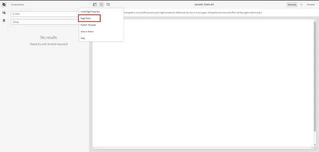
Step 3: Define Page Policy Settings
Click "Policy" to open the policy editor.
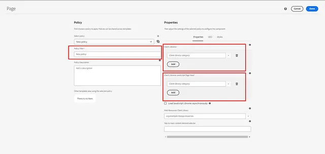
Step 4: Configure Settings
Define page-wide rules:
Client Libraries
Specify CSS and JavaScript files that load on every page:
CSS Libraries:
- /apps/project/clientlibs/core/main.css
- /apps/project/clientlibs/theme/brand.css

JavaScript Libraries:
- /apps/project/clientlibs/core/analytics.js
Why This Matters:
- Ensures all pages have required CSS/JS
- Prevents authors from accidentally removing critical libraries
- Maintains consistency across entire site
Main Selector
Helps AEM identify the main content area:
- Main Selector: main
AEM uses this to identify which part of the page is the "main content" for analytics and SEO purposes.
JavaScript in Head
Scripts that should load before the page appears:
<script async src="/apps/project/clientlibs/tracking.js"></script>
This enables:
- Tracking initialization
- Early performance monitoring
- Analytics setup before page render
Other Page Policy Settings
- Responsive Image Sizes — Define image breakpoints
- Viewport Settings — Meta viewport configuration
- Page Title Prefix/Suffix — Auto-prepend/append to page titles
- Redirect URLs — Redirect pages to different URLs
Step 5: Save Policy
Save the policy. Now all pages using this template will have these settings.
Page Policy Use Cases
- Brand Consistency — All pages load brand CSS
- Analytics Setup — All pages load tracking code
- Performance — All pages optimize images the same way
- Accessibility — All pages load accessibility libraries
Global Policy
Global Policy controls what components can be added to a container.
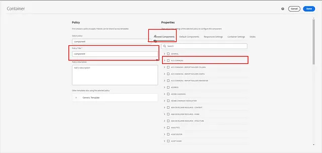
How to Add a Component Policy
Step 1: Select Container/Parsys
In the Template Editor, select the container where components can be added.
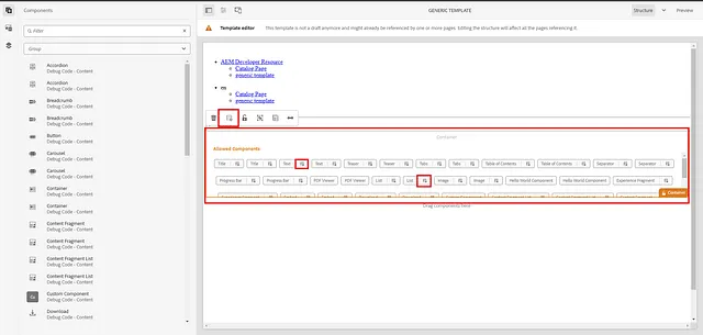
Step 2: Click Policy Icon
Click the Policy icon next to the container.

Step 3: Create or Select Policy
Choose to create a new policy or reuse an existing one.
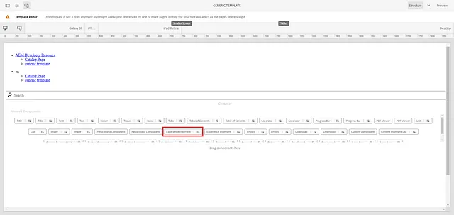
Step 4: Define Allowed Components
Specify which components authors can add:
Allowed Components:
- Title
- Text
- Image
- Button
- Teaser
Step 5: Configure Default Components
Optionally set default components that auto-populate:
Default Components:
- Image → Add image component by default
- Text → Add text component by default
Step 6: Other Policy Options
Configure additional settings:
- Background Images — Allow background images on components
- Responsive Columns — Define column configurations
- Styling Options — Enable Style System options
- Spacing — Configure padding/margin options
Step 7: Save Policy
The policy is now applied to the container. Authors can only add allowed components.
Component-Specific Policy
Some components need their own specific rules because they might:
- Contain nested components
- Require custom settings different from the container
- Need restricted configurations
Steps to Add Component-Specific Policy
Step 1: Select the Component
In the Template Editor, select a specific component (e.g., Image component).
Step 2: Click Policy Icon
Click the Policy icon for that component.
Step 3: Define Component-Specific Rules
Set rules specific to this component:
Image Component Policy:
- Required Field: Yes (must have an image)
- Image Ratio: 16:9 (enforce aspect ratio)
- Max Width: 1920px
- Responsive: Yes
- Style System: Enable alignment, border, shadow styles
Step 4: Set Defaults
Define default values:
- Default Alt Text: "Product Image"
- Default Title: "Click to add title"
Step 5: This will override parent
This component policy now overrides the parent container's policy.
The component will follow its own rules rather than inheriting the container's settings.
When to Use Component-Specific Policies
- Required Fields — Enforce certain fields on components
- Custom Sizing — Set specific width/height requirements
- Aspect Ratios — Enforce image dimensions
- Nested Components — Control what can go inside
- Brand Rules — Enforce brand-specific settings (colors, fonts)
Storage of Policies
Understanding where policies are stored is critical for architects.
How Policies Are Stored
Step 1: Open CRXDE
Navigate to: http://localhost:4502/crx/de
Step 2: Navigate to Policy Storage
Policies are stored under:
/conf/<project>/settings/wcm/templates/policies
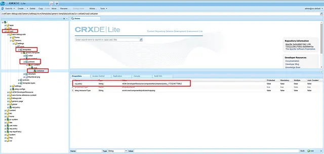
Step 3: Examine Policy Structure
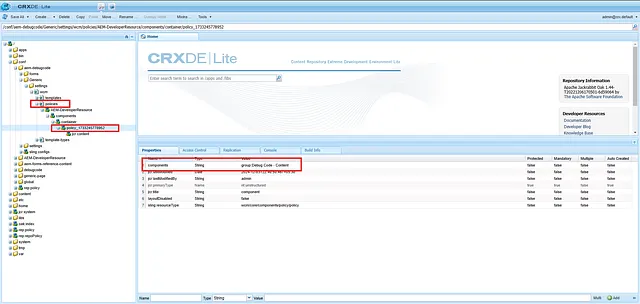
Each policy is stored as a node:
/conf/my-project/settings/wcm/templates/policies/
├── policy_001
│   ├── jcr:content
│   │   ├── cq:policy (reference)
│   │   ├── cq:componentType
│   │   └── allowed (allowed components list)
├── policy_002
└── policy_003
Step 4: Template References Policies
At the template level, only references to actual policies are stored:
When you open a template, you see:
/conf/my-project/settings/wcm/templates/article-page/policies
├── reference_to_policy_001
├── reference_to_policy_002
Step 5: Actual Policies Stored Separately
The actual policy definitions are stored under:
/conf/<project>/settings/wcm/templates/policies
You can see the reference number will match between the template and the policies folder.
Why This Architecture Matters
Separation of Concerns:
- Templates reference policies
- Policies are reusable across templates
- Update a policy once, affects all templates using it
Example:
Template A and Template B both reference the same "Article Policy"
If you update the Article Policy, both templates are affected immediately.
Result: Governance at scale
Policy Reusability
Policies can be:
- Created Once — Define policy rules in the policies folder
- Referenced Multiple Times — Many templates can reference the same policy
- Updated Centrally — Changes apply to all templates using that policy
Example:
/conf/my-project/settings/wcm/templates/policies/article-policy
├── Defines allowed components: Title, Text, Image, CTA

/conf/my-project/settings/wcm/templates/article-page/
├── References: article-policy

/conf/my-project/settings/wcm/templates/blog-post-page/
├── References: article-policy

/conf/my-project/settings/wcm/templates/news-article-page/
├── References: article-policy
Update the article-policy once → All 3 templates are updated
Multi-Site Policy Management
For large enterprises with multiple sites, policy management becomes critical.
Scenario
Your company manages:
- TechBlog.com — Technology articles
- LifestyleMag.com — Lifestyle content
- NewsPortal.com — News content
Each site has different:
- Brand colors
- Allowed components
- Author workflows
- Content governance rules
Solution: Separate Policy Hierarchies
Create policies per site:
/conf/tech-blog/settings/wcm/templates/policies/
├── article-policy (allows: Title, Code Block, Diagram)
├── author-policy

/conf/lifestyle-mag/settings/wcm/templates/policies/
├── article-policy (allows: Title, Image Gallery, Social)
├── author-policy

/conf/news-portal/settings/wcm/templates/policies/
├── article-policy (allows: Title, Video, Breaking News Banner)
├── author-policy
Each site can have identical component names but different policies!
Global vs Site-Specific Policies
Global Policy (shared across all sites):
/conf/global/settings/wcm/templates/policies/
├── core-components-policy (basic rules for core components)
Site-Specific Policy (overrides global):
/conf/tech-blog/settings/wcm/templates/policies/
├── core-components-policy (extends global, adds tech-specific rules)
AEM searches in this order:
- Site-specific policies
- Global policies
- Falls back to defaults
Advanced Policy Patterns
Pattern 1: Strict Governance
For highly regulated content:
- Page Policy: Lock entire page structure
- Component Policies: Allow only approved components
- No Style System: Remove style flexibility
- Result: Maximum governance
Pattern 2: Flexible Authoring
For creative content:
- Page Policy: Define only essential settings
- Component Policies: Allow many component combinations
- Style System: Enable extensive style options
- Result: Maximum author flexibility
Pattern 3: Balanced Approach
For most enterprises:
- Page Policy: Define brand standards (colors, fonts, libraries)
- Component Policies: Allow approved components with variations
- Style System: Enable safe style options
- Result: Balance between governance and flexibility
Key Takeaways
- Policies are the enforcement mechanism of templates, enabling governance without blocking flexibility
- Page Policies control page-wide settings (client libraries, analytics)
- Component Policies control what components can be added and how they behave
- Component-Specific Policies override parent container rules for special cases
- Policy storage is hierarchical — Policies are stored separately and referenced by templates
- Policy reusability scales — One policy can be referenced by multiple templates
- Multi-site implementations use site-specific policy hierarchies
- Architects use policies to enforce governance at scale without blocking author flexibility
- Policy patterns enable everything from strict governance to flexible authoring
Why Architects Care About Policies
From an architecture perspective, policies are powerful because:
- Governance at Scale — Control what 1000 authors can do without managing 1000 templates
- Reusability — Create policies once, reference them everywhere
- Flexibility — Authors have freedom within defined boundaries
- Maintainability — Update governance rules in one place
- Brand Consistency — Enforce brand standards across all content
- Performance — Prevent authors from adding slow or broken components
- Compliance — Enforce regulatory requirements (data privacy, accessibility)
- Multi-Site Scale — Manage different governance rules per site
What Happens Next?
In this chapter, we learned how policies enable governance and scalability in enterprise AEM systems.
You now have complete knowledge of AEM's template architecture:
- Chapter 8: Templates define page blueprints
- Chapter 9: Layout Containers enable responsive layouts
- Chapter 10: Style System enables design consistency
- Chapter 11: Editable Template Architecture Deep Dive
You now understand how enterprise architects design template systems that scale to thousands of authors and millions of pages while maintaining brand consistency and governance.