Core Components Deep Dive - When To Use, Extend, Or Build
Master Adobe Core Components. Learn why they exist, how they work, when to extend them, when to build custom components, real production patterns, common mistakes, and architect thinking. The comprehensive guide to component architecture in modern AEM.
Content Objective
In this chapter, you'll discover:
- What Core Components are and why Adobe maintains them
- How to decide between using, extending, or building custom
- Real production patterns from e-commerce, news, and finance sites
- Common mistakes that create technical debt
- Why architects prioritize component reuse
- How component inheritance works and why it matters
- Production troubleshooting strategies
Where We Are
So far you've learned about templates (Chapter 8), how Layout Containers structure responsive pages (Chapter 9), and how Style System keeps designs consistent (Chapter 10). That's the page-level stuff. Now comes the interesting part — actually building the pages themselves.
Every time you need to display something on a page, you face the same decision: Do I use what Adobe already built? Do I twist Adobe's component to fit what I need? Or do I build something from scratch? Get this decision wrong repeatedly and you end up maintaining five different "title" components across your projects. Get it right and your whole team works efficiently.
That's what Core Components are actually for.
What Are Core Components, Really?
Core Components are just regular AEM components that Adobe built and now maintains. They handle the basics — Title, Image, Teaser, Button, Container, Navigation, Tabs, Accordion, Experience Fragment, List. Nothing magic about them.
They use the exact same technology as any custom component you'd build:
- Sling Models for business logic
- HTL for rendering
- Clientlibs for CSS and JavaScript
- Dialogs for authoring
- Policies for configuration
The only real difference is that Adobe maintains them, tests them across versions, fixes bugs in them, and doesn't make breaking changes without clear upgrade paths. That consistency is worth something.
Why Adobe Built Core Components
Before 2016, it was chaos. Every company that implemented AEM would build the same components over and over. Company A built a Title component. Company B built a Title component. Company C built another Title component. They all worked slightly differently. Some had accessibility issues. Some didn't handle edge cases well. And when Adobe released a new version with security fixes? Everyone had to upgrade their custom Title components independently.
Every bug got discovered and fixed five times across five different companies.
So Adobe decided to reverse this. Instead of everyone building the same thing independently, Adobe built it once. Tested it thoroughly. Maintained it across all versions. Added accessibility from day one. Now when a bug is discovered, it gets fixed once and everyone benefits.
That's the philosophy: stop duplicating effort. Use what Adobe provides. Extend it when you need to. Build custom only when nothing else fits.
How Core Components Actually Work
When you place a Core Component on a page, here's what happens under the hood:
- You author something in the dialog (e.g., enter a title text)
- That data gets stored as JCR properties
- When the page renders, Sling looks at the
sling:resourceTypeproperty to find the component - Sling resolves the resource type:
core/wcm/components/title/v3/titleand locates the corresponding component implementation. - The component's Sling Model loads the properties
- The HTL template renders the HTML
- Clientlibs add styling and behavior
- Browser receives the final HTML
This is identical to how custom components work. Core Components aren't special — they're just examples of components done well.
Where Core Components Live in Your Repository
When you install Core Components via a package, they end up here:
/apps/
├── core/
│   └── wcm/
│       └── components/
│           ├── title/
│           │   ├── v1/
│           │   ├── v2/
│           │   └── v3/           (latest)
│           ├── image/
│           ├── teaser/
│           ├── button/
│           ├── container/
│           └── ... (many more)
These components should never be modified directly.
Customizations should be implemented through inheritance using sling:resourceSuperType.
Each component has multiple versions. You can have pages using v1, v2, and v3 of Title simultaneously. This is intentional — it gives you breathing room for upgrades.
When you need to customize, you don't touch anything in /apps/core/. Instead, you create your own component in /apps/yourproject/ and use sling:resourceSuperType to inherit from the Core Component.
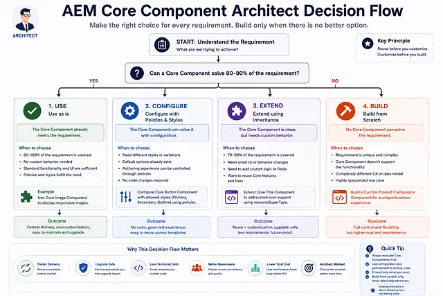
The Architect Decision Hierarchy
Experienced AEM teams usually follow a simple decision process when implementing new requirements.
Use Core Component
↓
Configure With Policies
↓
Extend Using resourceSuperType
↓
Build Custom Component
The goal is not to write more code.
The goal is to solve requirements with the least amount of custom code possible.
Every step downward increases:
- Maintenance
- Testing effort
- Upgrade complexity
- Long-term ownership cost
For this reason, architects generally try to stay as high in the hierarchy as possible.
The Three Choices: Use, Extend, or Build
When a requirement comes in, you have three options. Understanding when to pick each one is the actual skill.
Option 1: Use It As-Is
The easiest. Sometimes a Core Component does exactly what you need with zero customization. Title component displays a heading? Use it. Image component displays responsive images? Use it.
This happens more often than you'd think if you're not overthinking it. The best code is the code you don't write.
Option 2: Extend It
This is where most of your work happens. The Core Component does 80% of what you need. You need some additional properties, different rendering logic, or extra features.
You create a new component in your project folder and use this property:
<jcr:content
  jcr:primaryType="cq:Component"
  sling:resourceSuperType="core/wcm/components/title/v3/title"
/>
That line says "inherit everything from Core Title v3, but use my overrides where I define them." If you don't override something, it uses the parent implementation automatically.
This is the smart approach. You get all Core Component benefits (bug fixes, updates, consistency) plus your custom additions.
Option 3: Build Custom
Only when the Core Component solves less than 80% of your requirement. You've looked at extending and it doesn't make sense. So you build from scratch.
This should be rare. If you're building more custom components than extending Core ones, something's wrong with your architecture.
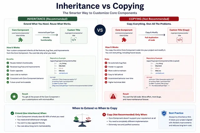
Inheritance vs Copying: This Matters
This is the most important architectural decision you'll make with Core Components.
Inheritance (the right way):
You create a component that inherits from Core. You only override what's different. When Adobe releases Core Component v4 with bug fixes, you get them automatically. When you upgrade versions, it's straightforward.
Copying (the wrong way):
You copy the entire Core Component code into your project and modify it. You now own that code forever. When Adobe releases bugfixes, you miss them. When they release v4, you're stuck on your modified v3. You've created technical debt.
I've seen projects with five different "Title" components because someone copied instead of inherited. Maintaining those is a nightmare.
Always use inheritance. Always.
Real-World Examples of These Decisions
E-Commerce Site: Product Page
A product page needs Title, images, rating, add-to-cart, related products.
- Title: Core Title as-is. Why customize what works perfectly?
- Images: Core Image as-is. It handles responsive sizing already.
- Rating: Custom build. This is business logic tied to your commerce system. No Core Component exists for this.
- Add-to-Cart: Custom build. This talks to your cart API. Not something Core Component can do.
- Related Products: Extend Core List. You need it to query related items by category. The Core List component almost does this but needs custom query logic.
Result: One custom component, one extended component, three Core Components as-is. That's the right balance.
News Website: Article
Article page needs headline, featured image, byline, article text, related articles, social share buttons.
- Headline: Extend Core Title. You want SEO-friendly heading levels and schema.org markup.
- Featured Image: Core Image as-is.
- Byline: Custom build. Author name, date, publication info. Specific to your newsroom.
- Article Text: Core Text as-is.
- Related Articles: Extend Core List. You want to pull related articles by topic.
- Social Share: Custom build. Your social strategy is unique.
Result: Three Core Components, two extended, two custom. Again, balanced.
Financial Dashboard: Account Summary
This is specialized. Account balance, recent transactions, alerts, scheduled payments.
- Title: Core Title as-is.
- Account Summary: Custom. Queries live account data from backend.
- Transaction Table: Custom. Real-time data, specific formatting for regulatory compliance.
- Alert Box: Custom. Compliance requirements.
- Container: Core Container as-is.
Result: Mostly custom because this is highly specialized business logic. That's okay. When your requirements are unique, you build unique things.
Common Mistakes I've Seen
Mistake 1: Building Custom Too Early
A requirement comes in. Before checking if a Core Component exists, before checking if it's 95% there, before checking if policies solve it... they build custom.
A week later they realized Core Container does what they need.
Do yourself a favor: when a requirement comes in, first check if Core Components already do it. Then check if extending is possible. Only then build.
Mistake 2: Copying Core Components
I mentioned this but it's worth repeating. I've seen projects where the team copied /apps/core/wcm/components/title/ into /apps/myproject/ and modified it.
Years later, Core Components v4 exists with accessibility improvements and bug fixes. Their copied component doesn't benefit. They're stuck.
Use inheritance. Please.
Mistake 3: Not Using Policies
Policies are underrated. They let you configure Core Components without extending them.
Example: "On this page, only allow buttons in blue color."
Wrong way: Build a custom button component. Right way: Use Core Button component, configure a policy that restricts colors.
Policies are powerful. Use them before extending.
Mistake 4: Ignoring Versioning
You have pages using Core Title v1. New pages use Core Title v3. You never planned an upgrade path.
Then security vulnerabilities are found in v1. Now you have to decide: upgrade all v1 pages? Build a migration strategy? This becomes expensive.
Think about versioning upfront. Plan a strategy to eventually standardize on one version.
Production Troubleshooting
Component Renders Blank
The page loads but the component shows nothing.
Check these in order:
- Verify the
sling:resourceTypeis set correctly on the content node - Make sure the component exists at that path (
/apps/core/wcm/components/...) - Check server logs for any errors during model instantiation
- If extended, verify the
sling:resourceSuperTypeis pointing to the right place - Make sure your HTL is valid
Inherited Custom Component Behaves Like Core
You created a custom component inheriting from Core Title, but it's rendering like plain Core Title. Your customizations aren't showing up.
Check:
- Is
sling:resourceSuperTypeactually set and pointing to the right Core Component? - Are your override files named correctly? If Core uses
title.html, your custom must override it consistently. - Is your HTL syntax valid? A syntax error means it falls back to parent.
- Are you looking at the right node? Make sure content is using your custom resource type, not the Core one directly.
Dialog Properties Not Appearing
You extended a Core Component and added custom dialog fields, but they're not showing up in the authoring UI.
Check:
- Is your dialog XML properly inheriting from parent? (
sling:resourceSuperTypein XML) - Are your new fields using unique names?
- Is the
_cq_dialog.xmlfile in the right location?
Why Your Architect Cares About This
Architects are not trying to reduce development effort alone.
They are trying to reduce the amount of code that must be owned, tested, upgraded, and supported over the lifetime of the platform.
It's not just about saving development time (though it does). Core Components represent a philosophy:
Stop reinventing wheels. Share common solutions. Build custom only for unique business logic. This keeps projects maintainable, scalable, and upgradeable.
An architect looking at your project asks: Are you using Core Components intelligently? Are you extending or copying? Are you minimizing custom code?
The answers to these questions determine whether your project will be easy to maintain in five years or a nightmare.
Summary
Core Components exist because everyone was building the same thing independently. Adobe built them once, maintains them, tests them, and makes them available for all projects to use.
Your job is knowing when to use them as-is, when to extend them, and when to build custom.
- Use as-is when the component does exactly what you need
- Extend when it's 80%+ there and you need customizations
- Build custom only when nothing else fits (and this should be rare)
Always use inheritance when extending. Never copy.
Get this right and your projects stay maintainable. Get it wrong and you create technical debt that haunts you for years.
In the next chapter, we'll explore Content Fragments and understand how modern AEM projects separate content from presentation to support both traditional and Headless architectures.
Enjoyed this chapter?
Get an email when I publish the next chapter. No spam — just new technical deep-dives.